Why nature‑inspired paint colors matter
Human beings are primates, and our relationship with color is both biological and cultural. Unlike most mammals, which are limited to two color‑sensitive cones, primates evolved three cones for red, green and blue wavelengths. This trichromatic vision probably gave our ancestors an edge when they were foraging for ripe fruit, reading subtle social cues or avoiding predators. Color isn’t just something we see, it’s an emotional language that influences how we think, feel and behave. Modern color psychology defines itself as the study of how hues and shades affect human thought, feeling and action. Researchers have repeatedly shown that color can shape moods, influence decision‑making and even affect our physiological responses.
Building a biophilic design with a color palette inspired by the earth
Biophilic design taps into this innate relationship with nature by integrating plants, textures, natural light and, importantly, paint colors. As Terrapin Bright Green explains, a properly executed biophilic design can reduce stress, enhance creativity, improve well‑being and even expedite healing. In a world where urban living and screen time often separate us from the outdoors, paint colors reconnect our homes to the rhythms of the natural world.
Color vision, diversity and individual differences
color perception varies widely among individuals. Primates are unique among placental mammals because they acquired trichromatic vision through genetic diversification. Yet even within humans there is significant variability. About 8 % of men and 0.4 % of women experience difficulty distinguishing red and green hues. This red–green color deficiency results from mutations in the cone‑opsin genes on the X‑chromosome. At the other end of the spectrum, a small number of women may have a fourth cone that grants exceptional color sensitivity. Cleveland Clinic notes that tetrachromacy, having four types of color‑sensitive photoreceptors, allows people to perceive hundreds of millions of colors, but it occurs only when a genetic mutation is combined with a brain capable of processing the extra information. Researchers estimate that around 12 % of women carry the genetic variation for an extra cone, although not all of them become true tetrachromats.
These differences matter when choosing paint colors. A hue that looks vibrant to one person may appear muted to someone with red–green deficiency. Conversely, people with enhanced color sensitivity may be overwhelmed by very saturated shades. When designing shared spaces, be considerate of each occupant’s color perception and test paint swatches under different lighting conditions.
Building a biophilic design with a color palette inspired by the earth
The psychology of color: how paint influences mood and behaviour
Color psychology identifies recurring emotional associations with specific hues. Although individuals and cultures differ, studies highlight several consistent patterns:
- Red is linked to passion, excitement and confidence but can also suggest dange. Designers often use it sparingly as an accent.
- Blue evokes calmness, stability and peace, yet darker blues can feel formal or even somber.
- Yellow radiates happiness, hope and warmth while sometimes signalling caution.
- Green conveys nature, growth and health; lighter greens feel energetic whereas deeper greens evoke serenity.
- Black and white are powerful neutrals – white suggests cleanliness or goodness, while black conveys elegance and power.
Warm colors such as red, orange and yellow tend to stimulate energy and positivity, while cool colors like blue, green and purple foster calm and relaxation. Complementary color schemes (opposites on the color wheel such as red and green or blue and orange) create high contrast and draw the eye, whereas analogous schemes (adjacent colors like blue and violet) provide cohesion.
In marketing and branding, color isn’t just aesthetic – it shapes perception. A University of Southern California summary of marketing research notes that people make judgments about a product within 90 seconds of a first impression, and color accounts for up to 90 % of the information that informs that decision. Consumers also evaluate whether a brand’s color matches its message; if a color feels incongruous, they respond less positively. Marketers leverage this by choosing colors that align with brand identity and by employing the Isolation Effect – using a unique color in a field of uniform hues to make elements like call‑to‑action buttons stand out. These principles translate to interiors: choosing paint colors that evoke desired feelings can influence how we experience a room.
Building a biophilic design with a color palette inspired by the earth
What makes biophilic design special?
Biophilic design is grounded in the idea that humans have an innate connection with the natural world. It incorporates nature through direct elements (daylight, plants, water) and indirect cues such as organic textures, patterns and colors. Historically, integrating nature into built environments goes back centuries, from Roman gardens to Islamic courtyards and even the Hanging Gardens of Babylon. The term biophilia was popularized by biologist E.O. Wilson in the 1980s, and today biophilic design is resurging as our cities become denser and lifestyles more screen‑dependent.
The benefits are compelling. Terrapin’s research shows that biophilic design can reduce stress and enhance creativity and clarity of thought. Bertch Cabinet notes that environments rich in biophilic elements can reduce stress levels by up to 60 %, enhance cognitive function and support better sleep patterns. Post‑pandemic wellness concerns, sustainable living priorities and the rise of home offices have accelerated interest in biophilic interiors. Natural materials and plant life improve air quality, while the soothing palette of leafy greens, earthy browns and sky blues reinforces our connection to the outdoors.
Building a biophilic design color palette
A biophilic design color palette draws inspiration from nature’s hues to create harmony. Here are principles and paint colors to consider.
1. Look outside your window
Designers interviewed by Livingetc recommend starting with the view just beyond your walls. The subtle greens of leaves, shifting blues of the sky and earthy browns of bark provide an effortless, harmonious starting point. This isn’t about matching your foliage; it’s about taking cues from the tones and textures outdoors. Desaturating colors, incorporating neutral undertones, can reduce overstimulation and create nurturing environments.
2. Find your “happy place”
When natural views aren’t available, channel the landscapes that make you feel most content. If you’re invigorated by the sea, a coastal palette with soft blues and sandy beiges may suit your home office; if forests soothe you, deep greens and browns can create a restful bedroom. color specialist Claire Gaudion encourages people to notice the tones of colors around them and reflect on how they feel. She notes that saturated hues can energize active spaces such as kitchens, while desaturated colors evoke tranquility for bedrooms.
3. Consider color sensitivities
Everyone sees color differently. People who share a home may have varying sensitivities – what feels relaxing to one might overwhelm another. Test sample paint colors on large boards, observe them under different light conditions and discuss with household members. Be mindful of those with color vision deficiencies (for example, avoid relying solely on red‑green contrasts) and those with heightened color sensitivity (tetrachromats) by choosing balanced, layered palettes.
4. Recommended biophilic paint colors
Below is a biophilic color palette with categories, emotional associations and example paint colors. Use it as a starting point and adjust based on your environment and preferences.
| Color category | Emotional association / notes | Example paint colors |
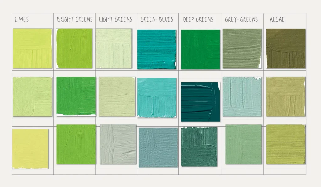
| Leafy & botanical greens | Evoke growth, vitality and a connection to vegetation; deeper greens are grounding while lighter greens feel fresh and energizing. | Pewter Green (Sherwin‑Williams SW 6208) – a muted botanical green; Healing Aloe (Behr S400‑3) and Hillside Grove (Behr M380‑5) from the BioNature collection. |
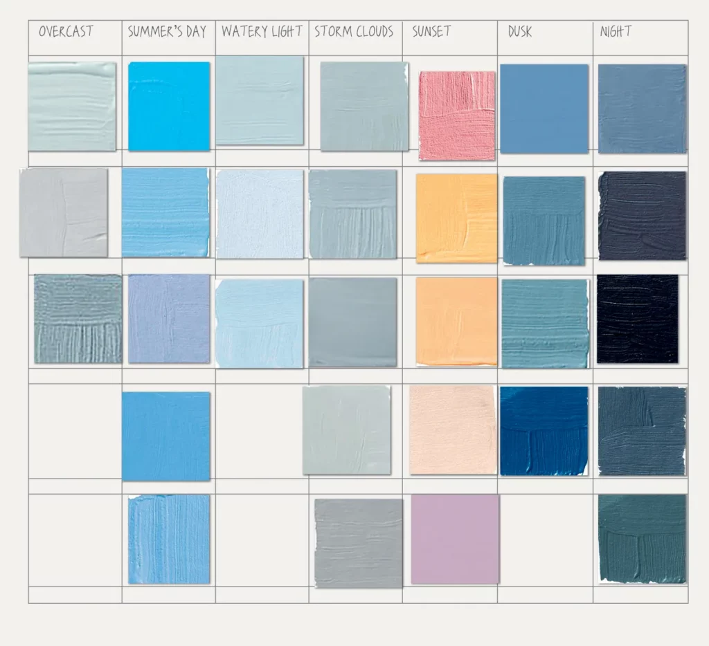
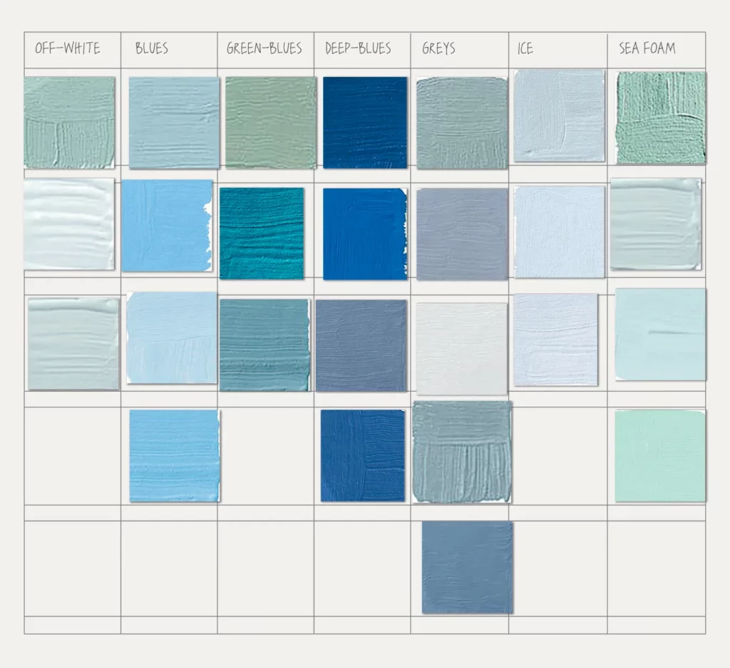
| Sky & water blues | Provide calm, serenity and a sense of expansiveness; lighter blues relax while darker blues convey depth. | Misty (Sherwin‑Williams SW 6232) – a soft, sky‑like blue; Deep Breath (Behr S460‑7); Ocean Boulevard (Behr PPU13‑10). |
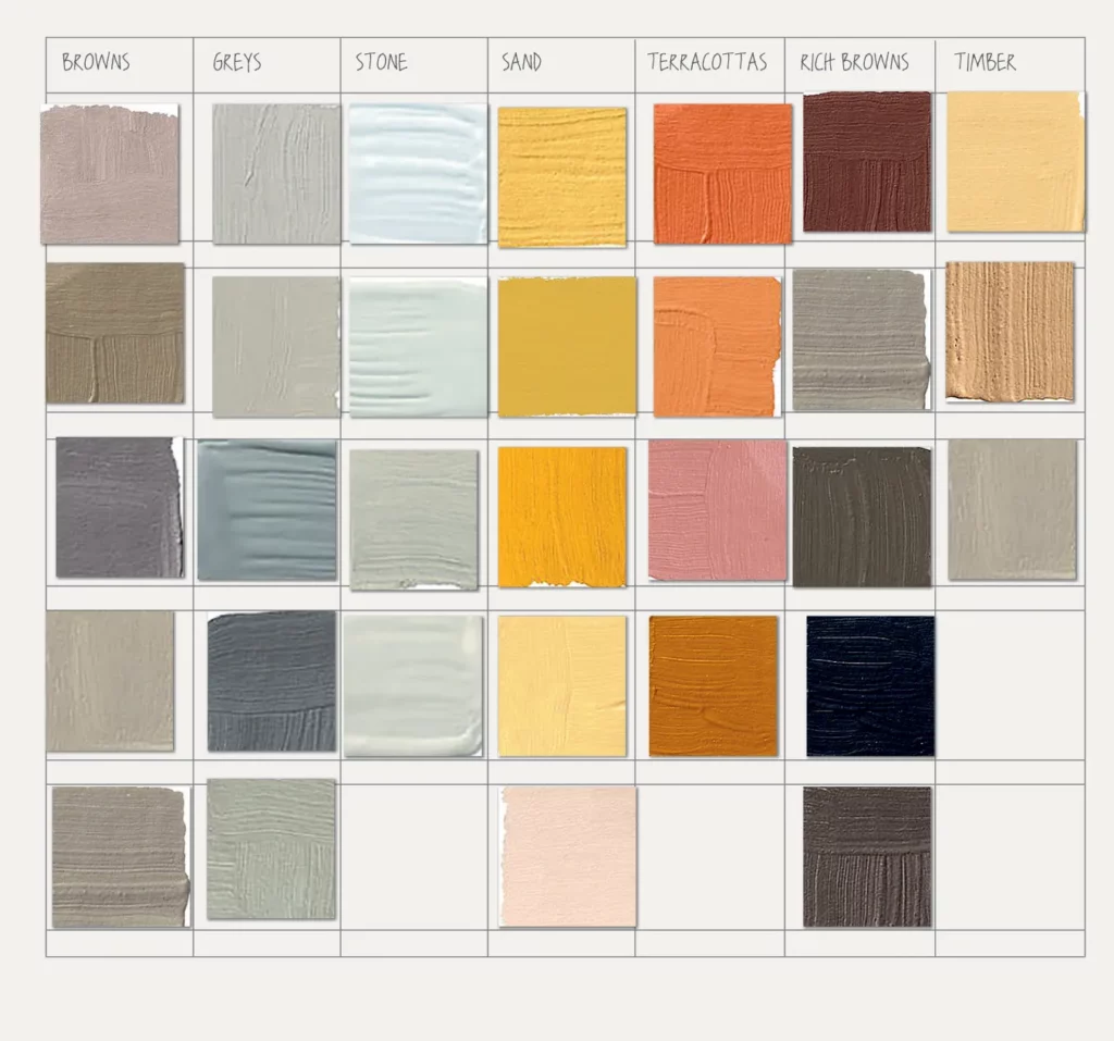
| Earthy neutrals | Browns, taupes and beiges ground spaces, recall soil and stone and pair well with greenery. | Even Better Beige (Behr DC‑010); Nature’s Reflection (Behr N430‑2); Pure Earth (Behr PPU7‑05). |
| Warm accent colors | Soft terracotta, muted gold or sunburst yellow introduce warmth and mimic sunlight; use sparingly to energize social areas. | Resort Sunrise (Behr M180‑2) – a gentle sun‑inspired hue; Sunburst (Behr PPU6‑03). |
| Soft whites & grays | Provide a neutral canvas that enhances natural light and allows plants and textures to stand out; whites convey cleanliness. | Breathe (Behr S360‑2); Tranquil Gray (Behr DC‑007); Natural White (Behr DC‑005). |
5. Layering and combining colors
Biophilic palettes work best when layered. Begin with a neutral base, soft white or light gray, on walls to create an open, airy feel. Add depth by painting an accent wall or built‑in shelving in a botanical green or watery blue. Incorporate warm accents through accessories or smaller surfaces like a kitchen island or a piece of furniture.
Complementary schemes can make elements pop, for example, pairing green with muted terracotta. Analogous schemes, such as combining varying greens and blues, foster cohesion. Warm colors (yellow, terracotta) energize communal areas, while cool colors (blue, green) calm bedrooms and offices. Remember to mirror the proportions found in nature: large expanses of neutral tones, generous swaths of greens or blues and smaller accents of warm colors.
Building a biophilic design with a color palette inspired by the earth
Practical tips for using biophilic paint colors
- Observe lighting: natural light changes color perception. Test swatches at different times of day and in artificial light to ensure the chosen paint colors maintain the desired mood.
- Prioritize sustainability: choose low‑VOC paints and finishes derived from renewable materials. Many companies now offer eco‑friendly lines; for instance, Behr’s BioNature collection provides 50 colors designed to “infuse harmony and wellbeing into built environments”.
- Integrate natural materials: complement your biophilic color palette with wood, stone, bamboo and wool. Bertch Cabinet highlights natural lighting, plant life and organic materials as core elements of biophilic design.
- Add plants and water features: living greenery reinforces biophilic colors and improves air quality. Plants, green walls and even small water fountains provide multi‑sensory connections to nature.
- Balance saturation: highly saturated colors can energize busy spaces, while desaturated hues soothe. Adjust intensity to match the function of each room.
- Consider cultural context: color associations differ across cultures; for example, white symbolizes mourning in some Asian cultures. Tailor your palette to your cultural background and that of your guests.
- Account for visual accessibility: use contrast and patterns, not just color differences, to ensure readability for people with red–green color deficiency. Avoid pairing colors that are difficult to distinguish without additional cues.
Bringing nature’s palette home
Our primate ancestors developed trichromatic vision to distinguish ripe fruits and social signals:contentReference. Today, this ability allows us to enjoy a kaleidoscope of hues and to harness color as a tool for well‑being.
Paint colors are a powerful way to evoke nature in our homes and workplaces. By understanding color psychology, respecting individual differences in color perception and drawing inspiration from natural landscapes, we can craft a biophilic design color palette that nurtures both body and mind.Greens, blues, earthy neutrals, warm accents and soft whites each play a role in this biophilic color palette.
Layering these shades thoughtfully and pairing them with natural materials and living plants can reduce stress, enhance creativity and help us feel grounded. As we spend more time indoors, embracing biophilic color principles is more than a design trend, it is an investment in our well‑being and our relationship with the natural world.
Join the biophilic movement and discover how you can transform your home or office into a thriving, nature‑connected space.


