Color is not just decoration, it is information. Humans are among the few mammals with full trichromatic vision, which lets us discern reds, greens and blues with fine nuance. That ability is thought to have helped early humans spot ripe fruit in green canopies and read subtle emotional cues in one another’s faces. Today, color still shapes how we feel and behave, from what foods we choose to which rooms we linger in. This guide connects color theory to biophilic design and offers practical, real-world examples of color perception at work in interiors and architecture.
Why color matters: the biophilia connection
Biophilia describes our innate affinity for life and living systems. In spaces, that affinity shows up as a preference for daylight, natural materials and colors tied to landscapes. When you translate nature’s palettes indoors, you tap into a form of “legible complexity,” a calm order our eyes recognize instantly. The result is not just prettier rooms; it is better mood regulation, clearer wayfinding and smoother social interaction.
Two caveats keep designers honest. First, color is personal. Some people are mildly or profoundly color-blind, while a small percentage, often women, may be tetrachromats who see more hues than average. Second, culture shapes meaning. One person’s soothing white may be another’s institutional glare. That is why a solid grasp of the psychology of color and on-site testing beats one-size-fits-all rules.
Color theory 101: from wheel to real
Start with color theory and color wheel basics. The wheel of colours maps relationships so you can predict harmony and contrast:
- Analogous palettes: neighboring hues, like blue-green-teal, feel cohesive and nature-like, ideal for restful zones.
- Complementary pairs: opposites, like red and green, energize. Use carefully for focal points or brand accents.
- Triads and split-complements: three-hue families balance variety and unity, helpful for wayfinding or multi-use spaces.
Remember three technical levers that change how colors feel:
- Hue: the family, such as green or blue.
- Value: how light or dark a color is.
- Chroma (saturation): how muted or intense it is.
The same hue reads very differently at distinct values and chromas. Hot pink is playful and loud; baby pink is gentle and airy. Navy can feel protective and contemplative; pale sky blue reads open and breezy. In biophilic terms, you are borrowing from dawns, forests, oceans and deserts, then tuning value and chroma for the activity at hand.
Color perception: what our eyes and brains actually do
- Context effects: a gray swatch looks lighter on a dark wall and darker on a light wall. Always test samples in the final context and under the real lighting schedule.
- Simultaneous contrast: bold complements intensify each other. A leafy green looks richer beside a muted red-clay tile.
- Light spectrum: LED phosphor mixes vary. Two 3000 K lamps from different brands can render greens differently. Check color rendering index (CRI) and, if possible, R9 for reds; verify samples under day and night settings.
- Afterimages and fatigue: saturated accents near monitors or task planes can cause visual stress over time. Keep high-chroma hues small and strategic.
Biophilic color moves that work in real projects
1) Bedrooms and restoration
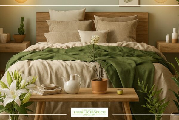
Aim for analogues of moss, eucalyptus and sea-mist. Use mid-value, low-chroma greens or blue-greens on the headboard wall to create refuge, then layer natural linen and wood. Keep high-chroma brights for small art or a throw.
2) Living rooms and social energy
Balance warm earths with cool plant greens. A clay-rose rug against sage walls warms conversation without glare. Complementary micro-contrasts—olive with a small marigold vase—add lift without shouting.
3) Kitchens and appetite
Nature cues linked to freshness help here. Soft herb greens, wheat and stone anchor permanence; small citrus notes in towels or ceramics nudge alertness and appetite. Avoid overly cool, bluish light that can desaturate food.
4) Workplaces and focus
Keep task zones in lower-chroma greens, gray-greens and wood tones that stabilize attention. Use saturated color only to punctuate wayfinding, collaboration corners and biophilic “prospect” moments near daylight and views.
5) Healthcare and calm
Lean into blue-green and mineral palettes, with wood or cork at hand-scale to warm touchpoints. Keep high-contrast patterns away from clinical equipment sightlines to reduce cognitive load.
6) Education and curiosity
Layer a neutral base with mid-value botanical hues, then introduce rotateable, high-chroma accents on movable pinboards and stools. This keeps core serenity while letting color support project cycles.
Materiality, light and the living palette
Color is never just paint. It is wood grain, stone veining, foliage, textiles and water reflections.
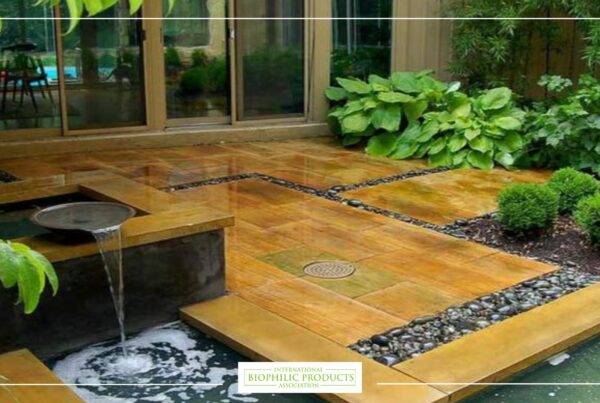
- Natural materials: oak, ash, walnut and travertine carry inherent color variation our eyes read as “alive.” They pair well with muted greens and blues.
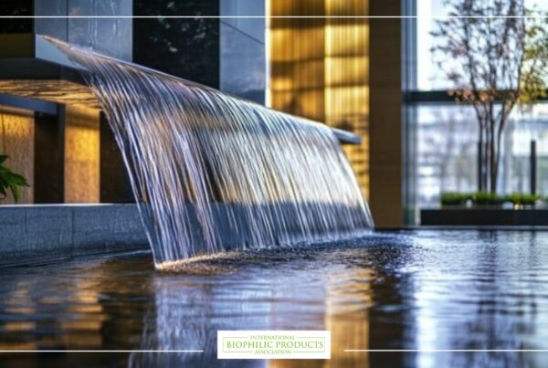
- Plants and water: living greens and subtle water shimmer deliver dynamic color shifts across the day; they are the original non-static accent walls.
- Finishes: matte and eggshell finishes feel softer and hide glare; high-gloss can amplify saturation and show defects.
- Lighting design: tune correlated color temperature (CCT) by zone. Warmer light at evening, cooler by day near windows. Prioritize high CRI sources so biophilic palettes read true.
Cultural and personal nuance: design for humans, not swatches
the psychology of color tells us meaning is learned as well as innate. Test assumptions:
- Gather three image boards: local landscape, cultural references, proposed palette.
- Build a pilot corner with the actual paint, flooring and fabrics.
- Observe for a full week under real use. Note comments, not just survey scores.
- Swap one variable at a time (value, chroma or material) so you can attribute reactions accurately.
Field-tested palettes: five biophilic examples
Coastal canopy
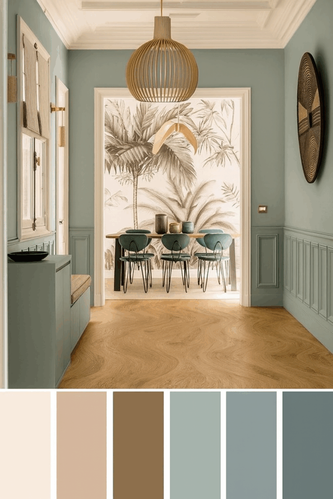
- wall: sea-mist blue-green, mid-value, low-chroma
- floor: white oak with visible grain
- accents: driftwood, woven cane, pale sand textiles
- use: bedrooms, therapy rooms, lounges
Temperate forest
- wall: desaturated sage and olive, alternating by plane
- stone: honed limestone with warm flecks
- metal: patinated bronze
- use: lobbies, living rooms, libraries
High-desert dawn
- wall: mineral pink-beige, low-chroma
- complements: muted juniper green, indigo textiles
- clay: terracotta ceramics to ground the scheme
- use: dining, boutique retail, hospitality suites
River city
- wall: cool gray with a touch of blue
- accents: leaf-green wayfinding, small mustard markers
- wood: walnut at handrails and desks
- use: offices, universities, transit lounges
Urban greenhouse
- wall: crisp off-white, high-CRI task lighting
- living layer: planters as “color sources”
- accents: celadon tile, bottle-green glass, charcoal metals
- use: coworking, cafés, galleries
Common pitfalls and how to avoid them
- Pattern soup: too many motifs plus saturated color equals fatigue. Choose one geometry to lead, one texture to support.
- Under-testing: colors that sing in the studio can flatten under different LEDs. Always mock up on site.
- Ignoring value contrast: accessibility suffers when text and signage do not meet contrast ratios. Think legibility early.
- Chasing trends: bright virals fade fast. Anchor projects in local biomes and materials for timelessness.
A simple workflow for color-led biophilic design
- Nature audit: collect local landscape cues—leaf, bark, stone, water, sky.
- Palette draft: translate cues into three analog families on the wheel, plus one complementary accent.
- Material map: assign colors to paint, wood, stone, textile, metal; avoid repeating the same hue across every surface.
- Light plan: select sources by zone, set dimming curves, verify CRI.
- Mockup and measure: test at scale for a week; gather qualitative feedback and adjust value/chroma before roll-out.
- Commissioning: document the final palette with brand-style swatches and maintenance notes.
Putting it all together
Biophilic color is not about copying a forest; it is about designing with the same logic nature uses: layered hues, balanced contrasts, gentle transitions and materials that age gracefully. When you ground choices in color theory, test them under real light and respect human diversity in color perception, you get spaces that feel intuitive on day one and even better a year later.


